Designing a logo is easy these days, anyone can do it and usually for free. There are lots of tools and apps – even AI can create you a logo, right? Why should anyone have to wait longer than a few hours and pay more than a fiver?
Of course these tools have their place for people who just want to tick a box and move one, or people who want to get really involved and tinker themselves. But for me, a logo should be something that is invested in. It should have an appropriate amount of time and consideration spent on it by someone who understands the language of logos and brand, and this comes at a cost.
There is a process that every design-related project should follow by nature, and logos are no exception:
The aforementioned apps and tools ignore most of these steps and, most importantly, the first step is the one that will make or break your project – if you haven’t done your research then you’re designing the wrong thing for the wrong audience.
This doesn’t need to be a life-sucking, time-draining monster of a document, more a series of notes and key takeaways from conversations that help inform the brief. Even if the client provides a brief, it’s worth digging deeper. Some of the questions you should be asking include:
You need to understand the objectives of the project and what they want to achieve with this new logo – is it simply a tidy up or a complete reposition? You also need to understand the state of the current brand as a whole, what currency and recognition it has. Is there a foundation to work from? Does the new identity need to align with anything existing?
Also, a competitor analysis will help you understand how the field of play lies, where the company currently sits within it and where they really want to be. By digesting all this information you should be able to form a strategy to achieve the objectives for the new identity. For example – Does the company want to feel more approachable or add a sense of gravitas? How do we achieve this visually using colours, shapes and typography?
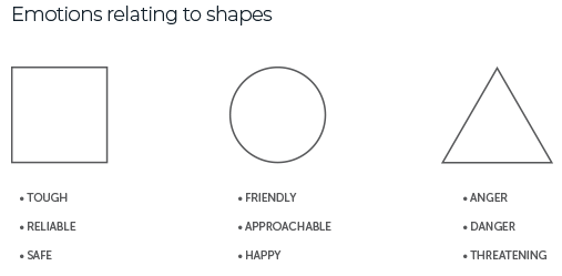
Initially you want to get all your ideas down on paper. Be they obvious, cliched, clunky, obscure, it doesn’t matter – just empty your head! Armed with a page full of raw ideas, it’s time to jump onto the computer and craft them into something more usable. You should be working in black and white at this stage – colour is just a distraction now until you have some solid designs. There are lots of things to consider – some you won’t even be aware of. The psychology of shapes will play a big part in how a logo (and a typeface) is perceived, and you can lean into that.
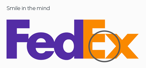
One thing I like to try and include in a logo if I can is a smile in the mind. These are easter eggs hidden in plain site that a viewer may not spot the first, second or tenth time they see the logo, but when they do, it will make the logo memorable and they will never forget it – you can’t unsee the hidden arrow in the FedEx logo!
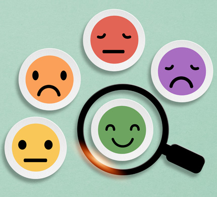
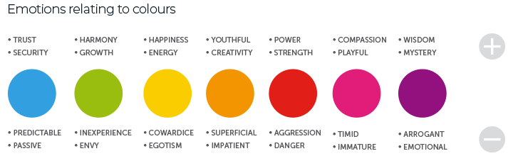
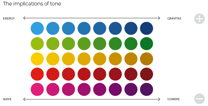
With a handful of solid ideas, it’s time to move onto colour. Visual elements, such as colours, are very subjective and so there needs to be rationale behind the decision making if possible. To begin with there is the emotional implications of colour. Whether you realised it or not, colours are eternally tied to emotional reactions. Whilst these reactions will depend upon your culture, experiences and personal preferences, there are a few universal emotions associated with colour that you can use in your process. The tonal value of the colours you choose can also be utilised to project a particular image of the company.
Let’s be honest here, it’s a minefield, and that’s ignoring colour theory. Over the years I’ve discovered combinations that generally work, others that don’t. Always be trying new combinations, new arrangements. You just never know for sure until you see it on screen.
I’ve combined these two steps because they are forever intertwined. Everything in design is iterating, testing, re-iterating and re-testing. The rule of thumb, where logos are concerned, is to keep things simple. Tweak your logo idea(s) only to the point you’re ready to present them to the client. The law of diminishing returns applies here though – you can break the back of a project quickly but then destroy any time saved by endless tweaking. Lean on the 80/20 rule and some common sense.
Presenting to clients has always been one of my favourite parts of my job. Seeing the reaction to the work you’ve done can be very rewarding, especially when you nailed it and they’re blown away by the results. These days, when I present to the client, I don’t just show them the final design, I take them on the same journey that I’ve been on, so that they can understand how we got here, and giving them the opportunity to make an emotional connection of their own with the logo. There may be some final adjusting, tweaking, switching out of colours to be done but we’re usually 99% of the way there. Whatever the reaction, you have to remain open-minded; you cannot be precious about your work. The presentation is more an educational endeavour than you simply banging your own drum. The end goal from the designer’s perspective should be to have a solution that answers the brief, and a client that loves the solution – after all, they’re the ones who have to live with it every day!
As a final part of the delivery, as well as a suite of logo files for clients to use, we always include a brand guidelines document. This maps out how to implement the new logo, gives colour and typeface references, and often suggests which version of the logo to use in which situation. It’s a living document so can be updated as the brand evolves and grows.
Much like photography, modern technology has made visual disciplines like logo design accessible to the masses. As a consequence it has become easy and cheap, and anyone can get their son or their mate to do it for less than a hundred quid, or even do it themselves for free. If you consider that value for money then, as a professional designer, I’m happy for you. However, any design project without a solid brief, research or strategy will miss the mark, or at least not achieve all that it should. We have refined all our processes, over countless hours and years of experience, to make sure they’re efficient and get the required results. We also want the journey to be enjoyable for our clients, and that they feel involved, emotionally attached and excited about the end result. Design projects like logos and websites should provide a wealth of fresh energy for an organisation, allowing them to kick on. Something conjured up within half an hour on a logo generator app is not going to do that. It’s not going to help you avoid the cliches and visual traps, and you’re not going to come away having learned something new. What sort of experience do you want next time to have to update your logo or website?